

Columbia Pictures
Articles | Awards | Bibliography | Gallery | Links | Image Credits | Studio Address
| Article 1 |
The History of a Logo:
|
|||||
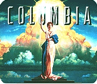
The "Columbia Lady" who has worn her toga and held her torch high for most of Columbia Pictures' seventy-five year history, has a history of her own, although the facts get a little fuzzy in places and are completely missing in others. The logo first appeared in 1924, and though multiple models have come forward over the years and claimed to have posed as the original lady, Columbia Pictures themselves (now owned by Sony Pictures Entertainment) says they have no records or documentation to verify any of the claims.
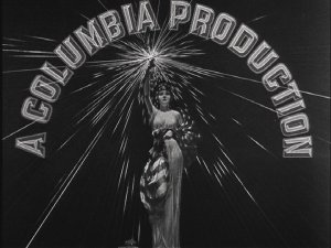
In Bette Davis' 1962 autobiography The Lonely Life, she makes a passing reference to "Little Claudia Dell", an actress from the 1930s and early '40s, "whose image," Bette remarks, "was used as Columbia Pictures' signature for years." But there are others. In 1987, People Magazine reported that a Texas-born model and Columbia bit-player named Amelia Batchler had modeled for the logo in 1933. And a February 2001 article in the Chicago Sun-Times reported claims by a local woman named Jane Bartholomew, who worked as an extra at Columbia in the 1930s, that she was the model for the version of the logo that appeared late in that decade. Given the many incarnations of the woman in the logo over the years, it is even possible that all three of these women posed as Miss Liberty at some point, each for a different version of the image. The logo as it appears at the beginning of IT HAPPENED ONE NIGHT (1934) is without clouds. The lady is featured with a dark bob and a kind of Cleopatra-like headdress across her forehead, standing (no feet or pedestal visible) under an arch of chiseled though square-shaped letters reading "A Columbia Production". She is draped in an American flag complete with the stars on her left shoulder and the stripes coming across her middle, supported by her left arm, and hanging down her right side. Her torch is displayed with a rather primitive, flickering style of animation emitting lines of light as rays.
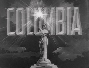
By the opening of MR. SMITH GOES TO WASHINGTON in 1939 however, the woman with the torch appeared completely different. Much more refined, ethereal and goddess-like, her facial features became less pronounced and she looked away (up and to the right) instead of straight ahead. Her headdress was removed and her hair swept back instead of hanging by the sides of her face. The drape over her shoulder became somewhat less-obviously an American flag, the stars on the left shoulder having been toned down in a shadow, and the stripes visible only on the portion of the drape hanging down her right side. "A Columbia Production" was replaced with the tall chiseled letters of "Columbia" running straight across the top section of the screen, with the lady's torch glowing in front of the "U" and clouds appearing for the first time in the background. A new form of animation was used on the logo as well, with a torch that radiates light instead of flickers.
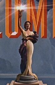
In 1941 the logo underwent another makeover. As the new logo appeared to introduce COMMANDOS STRIKE AT DAWN (1942), the lady looked much as she had in 1939, only the stripes were removed, and the flag became simply a drape without markings, dark on the left shoulder but only the shadows of the folds differentiating the rest of it from the lady's white gown on her right side. The "Columbia" lettering was also modified in 1941, still chiseled but less bold, and with darker shadowing. Sometime in the 1950s, the Columbia Lady's robe was redrawn and shaded so as to emphasize the plunging neckline. By the end of the 1960s she had lost her slipper-clad foot peeking out from the bottom of her robe as it divided just above the pedestal. Also in the 1960s, the clouds behind the logo became concentrated in the center and more billowy in shape. In 1976 the Columbia Lady was dropped from the logo altogether and replaced with a simple sunburst representing the beams from her torch. She returned in the early 1980s however, smoother in appearance and with much less detail. "Columbia" became "Columbia Pictures" on either side of the base of her pedestal, and in a less conspicuous rounded font. Some even described the lady's smoother body shape as resembling a Coke bottle. (Coca-Cola had bought the studio in 1982.)
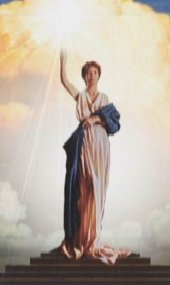
The logo's most recent overhaul was undertaken in 1993 when Sony Pictures Entertainment (which bought Columbia in 1989) commissioned illustrator Michael J. Deas to redesign the lady and return her to her "classic" look. The result, based on Deas' sessions with Mandeville, Louisiana homemaker Jenny Joseph who posed for him with a makeshift robe and torch, was a taller, slimmer Columbia Lady with lighter, curlier hair and a dimmer torch. Rather than use Joseph's face however, Deas constructed a composite face made up of several computer-generated features. Deas returned the giant chiseled letters to the logo, but the design was also updated for the 1990s. In the animated logo that appears before Columbia films on the big screen, the torch sparkles, the background clouds move across the sky, and a ring of light shimmers around the lady. © 2001 Reel Classics, L.L.C. |
|
See also the Columbia Logo Gallery page. Return to the Index of
Articles. |
| Now in Print! |
|---|
| Now on DVD! |
|---|
Buy Videos & DVDs |
|
Buy Movie Posters |
|
Buy Movie Posters |
|
Classic
Movie Merchandise |
|
![]() Printer-friendly version.
Printer-friendly version.
![]() Return
to the top.
Return
to the top.
Last updated:
March 10, 2011.
Reel Classics is a registered trademark of Reel Classics, L.L.C.
© 1997-2011 Reel Classics, L.L.C. All rights reserved. No
copyright is claimed on non-original or licensed material.
Terms of Use. Privacy Policy.


